![图片[1]-python怎么画出分布图?-uusu优素-乐高,模型,3d打印,编程](http://uusucn.zbbe.cn/wp-content/uploads/2024/01/5ece195a76bde541.jpg)
python画分布图代码示例:
#encoding=utf-8
importmatplotlib.pyplotasplt
frompylabimport*#支持中文
mpl.rcParams['font.sans-serif']=['SimHei']
#'mentioned0cluster',
names=['mentioned1cluster','mentioned2cluster','mentioned3cluster','mentioned4cluster','mentioned5cluster','mentioned6cluster','mentioned7cluster','mentioned8cluster','mentioned9cluster','mentioned10cluster']
x=range(len(names))
#y_0625=[39266,56796,42996,24872,13849,8609,5331,1971,554,169,26]
y_0626_1=[4793,100,0,0,0,0,0,0,0,0]
#y_0626_2=[2622,203,0,0,0,0,0,0,0,0,0]
#plt.plot(x,y,'ro-')
#plt.plot(x,y1,'bo-')
#pl.xlim(-1,11)#限定横轴的范围
#pl.ylim(-1,110)#限定纵轴的范围
plt.plot(x,y_0626_1,marker='o',mec='r',mfc='w',label='HighRating:MentionedClusterNumDistribution')
#plt.plot(x,y_0626_2,marker='o',mec='r',mfc='w',label='LowRating:MentionedClusterNumDistribution')
#plt.plot(x,y1,marker='*',ms=10,label=u'y=x^3曲线图')
plt.legend()#让图例生效
plt.xticks(x,names,rotation=45)
plt.margins(0)
plt.subplots_adjust(bottom=0.15)
#plt.xlabel(u"time(s)邻居")#X轴标签
plt.xlabel("clusters")
plt.ylabel("numberofreviews")#Y轴标签
plt.title("Asimpleplot")#标题
plt.show()
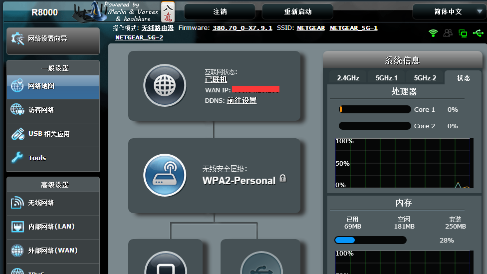
效果如下:

python画分布图的思路:
先在列表中定义分布图x、y轴的数值,然后使用plt.plot()方法即可将分布图绘制出来。
© 版权声明
文章版权归作者所有,未经允许请勿转载。
THE END